As I write this, key wat is simmering on the stove, part of the spice-of the-month-dinner for this month. Yes, it was really for November, but we’re behind. I’ve written about these dinners before. I’m also attempting to make injera, not with great success though. It fermented well, but the cooking is a problem. I can’t seem to do what the recipe said. Update: We ate the injera, which is not much in itself, but really fermented. It really went well with the spicy beef stew I made (key wat) and the spicy lentils and rice dish my sister made.
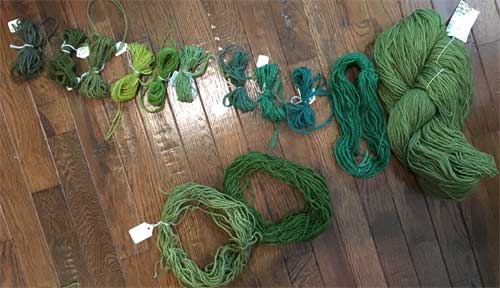
Greens in an order of some sort
I’ve also been organizing (kind of) the greens I may use for a commission. I labeled each sample with the dye formula, hoping to simplify the process a bit when it’s time to weave. I will be using different yarns for this projects, as it needs to be thinner and more flexible. Since I had these yarns all laid out, I decided to change the picture to black and white, just to see the values. It’s interesting to see those sometimes–there’s nearly always a surprise. From looking at this grouping, which do you think will be the darkest? The lightest?

Greens, same order in gray values

Combination of both greens and grays from Instagram
Here the two pictures are combined. I’ve written and drawn on the picture to show which ones surprised me a bit. It’s also interesting that several of the colors are so close in value, although very distinctive in their color form. The same is true for this piece. Some of the grays are so close together that they are hard to distinguish, especially in the lower right section, yet they work. If I had been working with gray scale, I might have woven something completely different–or not.
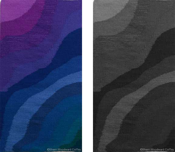
Deep, Cool Water–gray scale on right
I haven’t decide which greens will be used yet, so the color order is also not decided. After the colors have been decided, I will dye all the yarns, then lay them on the floor and make decisions. Of course, there will also be colors in between the skein colors, as some of the colors will be combined to make new colors. That’s the beauty of weaving, right?
Do you pay attention to gray scale? How do you use it?
What a delightful and interesting presentation of color and value! Sometimes it’s so easy to get lost in the glory of color without thinking about other design principles.