I read a post by artist Karin Olah about how she has her art printed via Spoonflower to use on notecards. Here’s what Karin does: Spoonflower prints my art image on cotton. Then I sew it to a blank card, adding a few fabric embellishments. Since my artwork is Mixed Media painting with fabric collage – the fabric touch is fun. Here is the example I saw. You can see the fabric touches she added later.

Karin’s note card. Notice the fabric embellishments
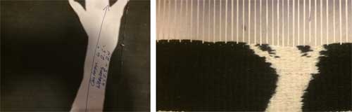
Below is the original image.

Looking Towards Shelter, fabric, gouache, pastel, and pencil on canvas, 6 x 4 inches
Karin has done this before with completely different work. Instead of landscapes, still lifes.

Limited edition series of quilted art cards. These cards start with a high quality print on Kona Cotton; then they are hand stitched with machine embroidered silk leaves and highlights added. Each 5 x 7 inch card is unique, signed, and numbered.
Granted, her work is mixed media, which involves using fabric, paint, gouache, and pastels on paper. Karin’s originals were also 6 x 4 inches, which is the size of her Spoonflower prints. Still, I had to try. This could be addicting!
If I were going to use these on a card, I would then cut out each motif and attach it to a card. A slight warning here…It took me a bit to get the hang of their system. Finally, I reduced all of my images so that the neared a 4 x 6 in. size, then chose to see a full yard of basic cotton.
- First, upload your image
- Change the size so that it might be somewhere around 4 x 6.
- Choose how much fabric
- Repeat as needed.

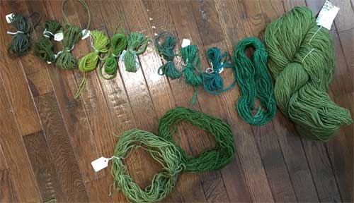
Summer Stripes, hand-dyed wool yarns, tapestry, Private collection
Amazing how the design looks so different when used in multiples. The Spoonflower version below is the Summer Stripe from above.
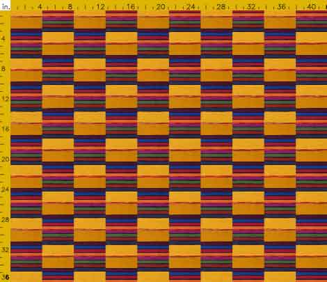
Summer Stripes, used in multiples for fabric design. Original: tapestry, 36.5″ x 60″, ©Sherri Coffey
Here are some more Spoonflower designs with their originals.

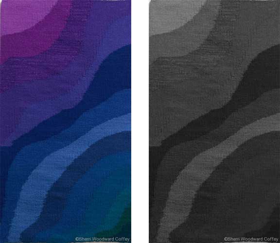
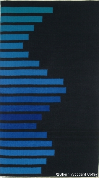
Deep, Cool Water, hand-dyed wool yarns, tapestry, 44.5 x 24 inches. ©Sherri Coffey, Private Collection

Same as above but used in multiples. Original: Deep, Cool Water, hand-dyed wool yarns, tapestry, 44.5 x 24 inches. ©Sherri Coffey
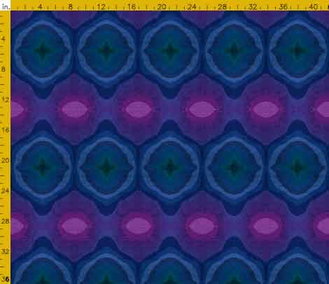
Same as above but used as mirror image. Original: Deep, Cool Water, hand-dyed wool yarns, tapestry, 44.5 x 24 inches. ©Sherri Coffey
Sine Wave, hand-dyed wool yarns, tapestry, 34″ x 61.75″

Wari, weft-faced ikat, hand-dyed wool yarns, 48 x 27.75 inches ©Sherri Coffey Private collection

Purple Rain, wool ikat, linen, dyes, 60 x 28 in, Private collection ©Sherri Coffey
Will I print these any time soon? Probably not, but the idea is worth pursuing at some point. Maybe I would even embellish with added bits. Try it for yourself, if you haven’t already. Have some fun, waste some time!