Category Archives: Art

Geometry, knots, and jail

Geometry

Geometry

Sacred geometry?

Sacred geometry?

A few rabbit holes have led me astray this week. A Facebook post by Jan Austin made me check out knotted tapestry, specifically by Anne Jackson. Then I had to look up knots, because I know nothing about knots, except the kind you use to tie the hook and/or lure to a fishing line. So half-hitch and two half-hitches will need to be practiced–someday. I can barely keep up with soumak, much less all the kinds of soumak, and so far, I can’t tell the difference between that and the half-hitches. That’s where the practice comes in, as diagrams just don’t do it for me.

more geometry

more geometry

And then there’s the sacred geometry and fractals in photographic form. Take a look at the photos. They’re much better than mine!

Finally, we come to islands of color, which is a feast for the eyes. Last, but not least, I received a Google Alert email about this posting. Even the name is spelled correctly, but the middle initial is wrong. I better not travel to Oklahoma!

A continuation

New-to-me ikat book

New-to-me ikat book

A continuation of the previous week around here–doing a lot of reading, thinking, and not much else. However, I did get a new ikat book, which I like very much, so far. There are a lot of Japanese words, only a few of which I have ever heard of before, but the instructions are very clear.

Ikat knot diagram

Ikat knot diagram

There are many diagrams, including how-to and traditional designs. They show clear steps and are easily understood. One thing in particular I could have used before: the one below is a diagram about enlarging a circle for ikat.

Enlarging circle diagram

Enlarging circle diagram

One thing I have noticed with all ikat books, when talking about weft ikat, they match up the pattern by letting any excess of weft hang off the selvage. Of course, that will not work for weft-faced tapestries. Those selvages have to be near perfect, the warp must be adjusted before weaving. Another method included in this book is to tie a section, but to to adjust the weft so that the section becomes a diamond or some other shape. That means that there are huge amounts of weft hanging off the right and left sides of the selvages. That’s just not going to work for weft-faced work. If you were going to sew the fabric, say a light weight cotton, would you want those weft sections hanging off the sides? Maybe I just don’t understand yet and need to read some more. Always possible.

There is also dyeing information, which I don’t think I need, but maybe at some point I’ll want to read about traditional and synthetic indigo dyeing.

I do like this book, though, better than others that I have. Definitely worth a thorough read.

It’s all about the tape

Rolls of ikat tape

Rolls of ikat tape

I wish I could describe what ikat tape is…Maiwa says it’s poly, but I’m not clear on what that is. All I know is that I can only find one source for it, it’s expensive, and because that source is Canadian, there are other expenses added to the cost. That’s a lesson I learned the hard way. I ordered one roll, but by the time all the other stuff was added to it, that roll was damned expensive. And by the way, the postman knocked on my door to have me sign papers, since the package “came for across the sea.” Now, if I order, I order multiple rolls, as many as the current budget will allow. I’m lucky that a friend gifted me with some tape she was no longer going to use. Thank you, Wendy.

Because the tape is thin, it really does go a long way. You can also easily split the tape for smaller sections. Since a local weaver is doing a first ikat project, I decided to look into buying tape again. Still the same ol’ source and no other that I could find.

This also made me drag out my ikat books, or at least try to find them–still missing one. In the books, they show that you can use different materials for tying, including kitchen plastic wrap for long sections. I think trying those other materials will involve a lot more practice for me, although in thinking about it, maybe that doesn’t need to be so tight because you wrap string around the whole section, making really tight ties at the beginning and end of the section. What do you think? would too much dye seep in? In the picture below, I tied an itty bitty piece of a section and decided it faster for the moment to continue in my usual way. You can see it third from the bottom, right side towards the center.

Ikat section 1 do-over

Ikat section 1 do-over

Years ago, I posted a video from You Tube showing a woman tying ikat. The video is silent except for the sound of the squeaking ties. I found it fascinating, but I still wonder what kind of material she’s using.

And speaking of alternative materials, I received a Uline catalog (do they ever stop sending those things?) with some possible wrapping materials. Will have to think about that.

In my search I did find some interesting sites to explore:

Strands of Silk you can see sections tied with string and other with just tape. Also a cartoon to guide with the design.

Andrea Schewe’s worktable blog Southeast Asia pictures and description of ikat tying and weavings

Backstrap Weaving Many interesting pictures of designs tied and untied, finished weavings, and an experiment by the author. I really liked the pictures here. There’s also a video.

And then there’s the exchange rate for Canadian/United States dollars

Canadian/United States exchange rate 6/28/2016

Canadian/United States exchange rate 6/28/2016

Rainy days

Azul y verde

Azul y verde

Other than the rain, there’s not much news around here. As I’ve said before, living in Texas, I hate to complain about rain. It hasn’t been that long ago that we were suffering a drought, but currently, we’re getting about an inch of rain–per day! And I’m one of the lucky ones. Other sections of Texas are flooding and people are dying. I can only imagine what they’re going through.

The pieces above were cut off, strictly experimental with color. The bottom one has warp showing. I wanted to see how the color would shift with the white warp showing. Actually, the colors are pretty striking in person. I’ve decided that I like it enough to actually finish it, but therein likes the current problem. Since it’s not woven thickly like a tapestry or rug, I don’t know yet how it will look with a hem. Nothing to do but just try it. So, it’s steam-and-hem day, perfect for another rainy day.

And below is what I’m working on with the ikat. See the design yet? After this piece, I think I’m going to do some of what I call freestyle ikat.

New project

New project, part of prairie series. What’s it going to be?

Crystal Bridges

Crystal Bridges

Crystal Bridges

A friend and I have been  talking about going to Crystal Bridges for a few years now, then she mentioned it to another friend, and a ladies’ weekend was born. It just so happens that these friends are friends from going to school together in the small town where we grew up. Nice to have friends that have been around for that long. They know everything!

Some of us drove to Bentonville, Arkansas from Texas and two others drove from Tennessee. After all the driving, the consensus is that map programs suck! But we got there and stayed in a nice Airbnb house with four bedrooms and three baths, with a large space to gather and visit–quite reasonably priced, too.

For those of you who don’t know, Bentonville is the original home of Walmart. However, all of us were surprised to find a cute downtown area square with a park in the center. Further, Alice Walton is the one who studied art, built the museum, and bought the art for the museum. She did an excellent job.

This was the first thing we saw as we drove close to the museum building. it’s quite impressive.

Roxy Paine

Roxy Paine

Roxy Paine

Images

And then there’s this in the courtyard. She has eggs, hence the title.

Louise Bourgeois, Maman

Louise Bourgeois, Maman

Louise Bourgeois

Images

And then this…

Philip Haas

Philip Haas

Philip Haas

images

I took lots of pictures inside the exhibition area, but I keep coming back to this one. Yes, it’s graphite and ink on board. Take a look at the detail. It’s from the elbow of the woman on the right. Amazing! The image is itself so poignant, but when taken with the skill involved in creating this art, well, it’s incredible.

Charles White, Oh, Mary, Don't You Weep, 1954, graphite, pen, and ink on board

Charles White, Oh, Mary, Don’t You Weep, 1954, graphite, pen, and ink on board

Oh, Mary, Don't You Weep (detail)

Oh, Mary, Don’t You Weep (detail)

Charles White

Charles White images

The museum is large and these are only a few of the images. I’m posting more on Instagram–gradually.


Another lesson learned

Green-paraments3

Keep in mind–these pieces will be about 30 or more feet from each other when displayed.

paraments-not mirror image

paraments–not mirror image

Before writing this post, or at least titling it, I realized that I’ve written about learning lessons fairly often, so I did a search for “lessons.”  No matter, I’ve got another lesson learned. As you may remember, I’ve been doing a commission of paraments for a local church. Now usually, when I do commissions, I dye the yarns, then go to the client’s house (or in this case, the church) and get approval for the yarns. This commission was voted on by a committee, and though I had submitted some of the yarns, not all of the colors were dyed at the time. In planning the weaving, I put all the colors on the floor and arranged and rearranged them until I found the order that I thought looked best. Here’s the lesson: I should have taken all those yarns and spread them out in the sanctuary. It never occurred to me that the lights would affect the colors so much. One of the greens, obviously a green, albeit an olive-y green, looks brown in those lights. And it’s in the middle! It bothers me, but one of the ladies mentioned how that color looked good with the wood of the pulpit. I know, this is the usual thing. The maker sees all the flaws, although I guess it’s debatable if this is a flaw or not. So, lesson learned! Even though it might inconvenience people, ask to go into the sanctuary and check out the colors. Go into the living room and check out the colors. Go!

Paraments-mirror image

Paraments–mirror image

Mark Making

An unsuccessful start

An unsuccessful start–wonder if I can do something with this.

So what does a mark making book have to do with a weft-faced weaver. I’m not really sure, but I’m going to experiment with making marks on some sampling that I did. Kind of tells your right there that the sampling was not entirely successful, doesn’t it? Or it could have been successful, but I just didn’t like weaving it.

Mark Making

Mark Making

The mark making book that I’m talking about is called Mark Making: Fresh Inspiration for Quilt and Fiber Artists by Helen Parrott. Since I wanted to look at the book before buying it, I had to request it from the Interlibrary. For my purposes there’s one chapter in particular that I’m going to experiment with, although there’s a lot of information that might come in handy for inspiration or just developing a system for creativity. Sounds strange to use creativity and system in the same sentence, but we do need a system, of sorts. You can see some of the topics here in the table of contents.

Mark Making

Mark Making

Love these stitches!

Love these stitches!

Black and White sample

Black and White sample


Speaking of sampling, I did a small tapestry section of the cartoon from last week. I discovered that weaving that particular design would drive me batty! I went back to my original plan to do it with ikat. Then, in setting up the ikat table and boards, I realized that I needed to re-do the cartoon. The re-do will be on vellum graph paper, drawn by hand, since getting enlargements is such a trial nowadays.

What’s next?

Peppers in the grocery store

Peppers in the grocery store

I had to include the picture of the peppers because they make me smile, even though I had already posted it on Instagram. Aren’t they beautiful? I was tempted to bring some home just to look at, not being overly fond of peppers, but they were $5.00/pound. And I’d want a bunch to look good, so…

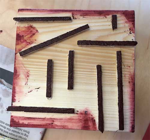
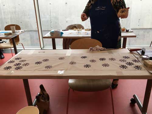
I took a workshop at the Kimbell Art Museum last week related to Japanese printing, although I’m not sure the actual printing actually had anything to do with Japan. We did go into the Asian room and look at all the beautiful screens and looked at slides of others, but they were painted, not printed. Then we had a wooden block and objects to glue onto it to make our printing block. There was a long piece of cotton taped and pinned to the table, so that once we had our blocks ready, we used a brayer to spread paint onto plexiglass. Once the brayer was filled, we rolled it onto the blocks and printed.

Printing block

Printing block

I wanted a random pattern because there’s no way I could get everything to line up, which would frustrate me no end, as that perfection demon sits on my shoulder. Notice how some of the block prints off the “real” fabric. Also notice that the printing looks black, although you can see from the block above that it’s really a dark red. Oh, well. Wonder if it will change if it’s washed.

Cloth pinned on table

Cloth pinned on table

Below is just the fabric. I see there are a few empty spots.

Cloth printed

Cloth printed

Maybe I should have done something like this rug in a Target ad, or the other black and white ones designed by Nate Berkus. I really wish I could include a picture here, but don’t want to violate any laws.

My neighbor took much more care, not only to make her block, but in the printing she uses too close-together colors. Nice job!

My neighbor

My neighbor

Next weaving?

Next weaving?

It’s time to decide what to weave next. This is a part of a cartoon for a weaving. (Ever notice how when you take pictures of paper, it never looks white?) I made the lines right angles but can’s decide if it would be better if they were woven at a different angle. The right angle part was to just keep it simple. Thoughts? Advice?

Frank Stella

©Sherri Coffey-Rhombus

Rhombus Wool, cotton, dyes 54.5 x 29 inches $675 ©Sherri Coffey

Exhibition catalog

Exhibition catalog

FRANK STELLA: A RETROSPECTIVE opened on April 17 at the Modern in Fort Worth. The members’ opening reception was Friday, April 16. Although it started at 6:00 pm, I arrived early because I was concerned about parking. I am so glad I did! The curator’s tour of the exhibition was in progress and was very educational. I have found that when you learn more about a particular piece of art, I can enjoy it more, even if it’s not exactly a favorite. A curator tour is not always available, but a docent tour usually is, with a bit of planning–note to self.

The exhibition is organized into several rooms, sometimes by the type of paint used, sometimes by series–or maybe those are both the same thing, as in the copper series. The Moby Dick series is in a room which can also be viewed from above. In these pieces there is a general feeling of water, which is more evident standing in the room above. The Copper series is in another room. (And as an aside, our group was told that Stella used to have to paint the hull of the family boat with copper paint.) He also used Benjamin Moore paint for a series. Also, look Jasper’s Dilemma, one of his larger Benjamin Moore paintings. It is made up of concentric squares, which draws the eye to the center, but look at the surprise when your eyes get there.

Below is a picture from the book with small Benjamin Moore paintings.
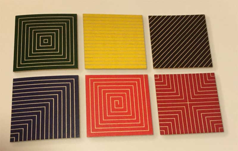
Small group of Benjamin Moore paintings. Each is approximately 12 x 12 in.

Small group of Benjamin Moore paintings. Each is approximately 12 x 12 in.

Frank Stella’s work is colorful and have interesting shapes that draw the eye, but I even like the black series. Maybe the main reason they are so appealing to me is they make me want to immediately get to my design desk and start drawing. And as a girl who discovered that she owned seven protractors when reorganizing the office, how can I resist a series called Protractor?*

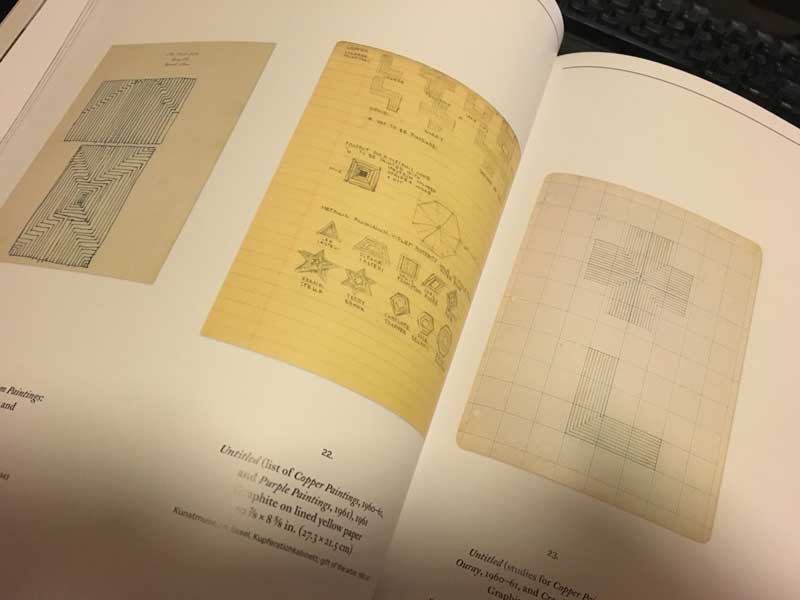
Process is also fascinating to me, so I was pleased to find several plates of studies and maquettes for his various series. All of the pictures here are ones that I took of some of the pages of the catalog of the exhibition. There were no studies for the Protractor series, but MOMA has some online here and here. A whole page of studies and maquettes can be seen here.

Irregular Polygon series maquettes.

Irregular Polygon series maquettes.

Images of the Irregular Polygon series can be seen here.

Planning-3

Studies from the exhibition catalog

Planning-4

Studies from the exhibition catalog. I love that he uses notebook paper and graph paper! I have a whole drawer of graph paper.
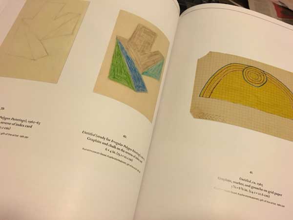
more studies

more studies

There is also a large selection of sculptures in the exhibit, not my favorites, but when you know a bit more about the work, they become much more interesting. By the way, we were told that Stella calls them paintings. When you look at those huge pieces, you can see why he would need the large, one acre enclosed studio space he has in upstate New York. Yes, one acre!

I found some great interviews or articles about Stella. One of my favorites is this one from the Wall Street Journal. In fact, WSJ has several articles about Frank Stella,  here and here. Which reminds me, that I enjoyed reading the titles of the pieces, and there’s an article about the wacky titles. Also, if you’ve never checked out WikiArt, it’s worth the effort. They also have an app (for that).

*I use protractors as part of the design process because of angles. Certain angles can be woven as smooth lines, while others will be stair-steppy. I like to weave smooth lines, so use the protractor to make sure the angle is one that weaves smoothly.