Category Archives: Color

Evolution of a design, part 2

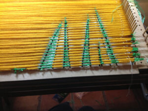
1.5-hours The design I wanted to have is shown in the previous post here.  Executing the design is a different matter entirely. Grass-ikat The plan was to do this in ikat, which presents its own set of problems, at least in the learning stage I’m in. (About this supposedly being yellow grass–that decision came about because of the ikat portion of this equation. The yarns need to be a color that can be overdyed nicely)  After enlarging the cartoon, I started tying the weft yarns, which is not a problem, just time-consuming. The yarns are then dyed Shuttle again, ties removed and it’s ready to start weaving. And that’s where the problems begin.

In order to weave the design that’s tied into the yarn, the warp needs to be the right width. Unweaving and reweaving happened over and over before the “real weaving” could begin. And I wasn’t really happy with the real weaving result, so a design change was in order. Two sections of this design was ready, and I was not going to spend more time tying more ikat yarns if I wasn’t happy with the weaving. So, another design was born.

Do you have a weaving project that just didn’t work after you stated weaving? Did you change the design, leave it as is, or what? Sometimes I envy quilters who have design walls where they pin up their design. I do the next best thing I can think of, but maybe there’s a better way. Next time…


Colors and mental floss

Have you heard of the magazine called Mental Floss? It’s a magazine that has “random, interesting, amazing facts,” according to their website. I don’t have an opinion about the amazing part, but it really does have random and interesting down pat, and I am not a trivia person. Just don’t see the need to have all that extraneous cluttering up my mind.

The magazine also has its own Facebook page, where I saw this little nugget of information–11 Colors That You’ve Probably Never Heard Of. Now we weavers are all about color, so of course I had to check it out. And they were right, I had never heard of most of these colors: sarcolene, coquelicot, smaragdine, mikado, glaucous, wenge, fulvous, xanadu, falu, eburnean, and amaranth. I’ve known that amaranth grain was used by ancient peoples, and you can still buy the seeds today, but I did not know about the color, which makes sense when you look at the picture of the flower.

Another example of random, interesting (weird?) facts from Mental Floss: The Dirty Etymology of 9 Everyday Words Etymology. Gotta love it!

Books, Part I

ColourBook

Colour: a workshop for artists and designers

I’ve been thinking about a series based on how color interacts and appears with other colors. I’m also interested in the phenomenon called simultaneous contrast. Not having ever had any formal study of color, I usually just go with my gut, and frankly, I kind of don’t want to mess with that.

Anyway, I pulled a book on color off the bookshelf, and it’s exactly what I wanted. In fact, I may actually do the exercises! Gasp! The book is called Colour: A Workshop for Artists and Designers. The exercises utilize gouache paints to try out the different principles in the book. Then, by the time you’ve done a few exercises, you will have a pile of painted papers to use for the other exercises. This appealed to me because I have often thought about painting papers with colors that I like and then combining them to make a design, like Matisse did later in his life. You can see a bunch of those compositions here.

Maybe I’ll set up a card table in the spare room and play with paints. I’ll keep you posted.

Filters

Tangled skeins are what I’m dealing with

In the process of prepping the skeins for dyeing, they were soaked in the washer with Synthropol. When it came time to actually do the dyeing, I turned the dial to spin, or at least I thought I did. It took me a few minutes to realize that the washer sounded all wrong. Turns out that I had moved the dial to rinse and these yarns were being agitated. And oh what a mess of tangled yarns.

Tangled

Tangled mess

While balling up many tangled skeins of yarn–and tangled yarns take a really long time to ball–I suddenly realized that I could demonstrate the red and green filters.

Magenta-Yarns-2

Magenta-ish yarns

Magenta-red-filter.

Magenta yarns with red filter

Magenta-green-filter

Magenta yarns with green filter

These aren’t good pictures, but the idea is shown. Above are the yarns in their natural state. On the left are shown the two filters. It’s probably obvious which is which.

Greenish-Yarns

Greenish-blue yarns

Below are some greenish/blue/turquoise yarns, even though they don’t look like it in this picture. Even farther down are pictures showing the same yarns with the green and red filters. In theory, these filters are supposed to “remove color”, making it easier to see value among the yarns. The instructions say that for most people, the red filter is best. However, if you are looking at reds, switching to the green filter may be better. And the reverse–looking at greens, the red filter may work best. You be the judge. I think you can also do the same thing with a black and white photo.

Greenish-green-filter

Greenish-blue yarns with green filter

Greenish-red-filter

Greenish-blue yarns with red filter


Value

Ruby-Beholder

Ruby Beholder

magenta

Magenta yarns

Yarns-blk-wht

Black and white of the magenta yarns

In a rag weaving workshop, I remember the instructor saying that when you don’t like the colors in a design, it most often is because of value. And that’s the first time I heard of the Ruby Beholder.

Usually you just know if a color doesn’t go with the others, there are other ways to check the value in the colors we choose. I took a black and white photo, thinking of the gray scale, but you can use an actual gray scale finder. Still another way is to use red or green filters. The handy tools come to us mostly from the world of quilters.

Gray Scale

Filters

Gray scale

Gray scale

While looking at my magenta yarns again the other day, I decided to get out the color wheel. When I pulled open the drawer that held it, I found something better, the 3-in-1 tool by Joen Wolfrom.

3-in-1

Color Tool

3-in-1-pages

Color tool contents

This tool has separate pages for lots of colors, from yellow green to aqua green, with all of their variations on little color rectangles on each page, AND there are also two filters, both green and red. If you want to read a bit more, all of the tools can be found on Amazon here.


Winter treats

LemonBlossom

Meyer Lemon blossom

Meyer Lemon

Meyer lemon

Not being from California, Florida, or even south Texas, I had no idea how wonderful fruit tree blossoms could smell. Since I am now the proud owner of a Meyer lemon tree, I now have some first-hand experience. The tree is now in the hallway, so every time I walk there, I get that marvelous scent! Makes me smile! Frankly, I know nothing about having fruit trees inside, except that I know it’s done. And I know even less about Meyer Lemons, but it WAS a special price. 🙂 🙂

Another treat for the winter doldrums: fresh flowers. My daughter gave me a gift card to Central Market, which I save just for flowers. These Gerbera Daisies were everywhere yesterday, in many beautiful colors.

You can see from these pictures that I’ve got a red thing going on. What about you? What color draws you in?

Treating myself

Collage

Artistic endeavor???

This week has been really big week for me so far. Not only am I having lunch out with friends twice–yes, two times!–my first workshop in the new studio space at the Kimbell was on Wednesday. What fun! As usual, the docents took us in small groups to view selected pieces, pointing out special details that they wanted us to notice and giving us information that we might not know about the artist or the work. All of the work that we viewed were in the exhibit Picasso and Matisse, and all related to collage. The works were not actual collages, but looked like a collage, probably having been constructed as an actual collage and then painted. Then we returned to the studio, which is absolutely marvelous. There are three studios, each with built in cabinets designed by the education director to include amenities that have been needed. Before, there was not even one room for studio creating. All was done at tables in the lobby as patrons walked by.

There were painted canvasses of various colors, but of course, I chose red. There were many interesting papers to choose from, stencils, and paints. What I found most interesting was that I started out with an idea that morphed into another idea entirely. I’m pretty happy with my work of “art.” And it was fun.

What does that tell me? Probably that I need to get out more, but also that playing around with new forms of art is good for the soul, that I need to do more experimenting with art at home, and let myself play without that critical voice saying a darn thing! Try something new!

Experimenting, part 2

Ikat

Even my weaving is an experiment. I really should be “sampling,” but I just go all out, so weaving is not the refuge that it usually is. I took out all the weaving that I pictured last week and started again. It seems to be going better this time around. I’ve decided I’ll complete the first section and then make a decision—cut off or continue.

Giving up?

I told myself that I would experiment with this for three months, so giving up is not a good option. However, I could go back to only rectangular shapes until I have a better handle on what is measured on the ikat board and what actually weaves up. Hmmm…

What I’ve learned this go-round

Detail-center

Weaving

Detail

Woven

Section-1

Woven

One of the things that I’ve learned is to try to center the next pick with the one before it. That means forgetting those marked warps and trying to weave the design according to those. By centering the wefts in this way, they make the shape they’re supposed to make. On the left is a section woven in this manner. Now, that doesn’t mean they’re as good as I would like, but an improvement over the bottom picture–which I took out.

Dyeing

Yellow-yarns

Trying all of those WashFast colors that I have is another experiment. After my initial disappointment, I’m really liking the colors. I’ll put them all in a pile and take a picture soon. Also need to make sample sheets, since the samples that I received are dyed at different percentages. Above are two yellows. The skeins are WashFast and the ball is the yellow from my usual dyes. The new yellow has a greenish cast, although not as severe as in this picture. Below is an adjusted picture. Not much better after all….just believe me!

Yarns-adjusted

Photo adjusted

Ikat Dyeing

More on this later, but experimentation here also. I’m not even dyeing the other tied sections until I decide the fate of this piece.

It’s winter!

Icy-Trees

Icy trees

Let me say right off, I’m not a big fan of winter. I may have mentioned that before. For sure! Winter did arrive, even here in Texas, although it did not live up to the predictions of the weather folks. The streets were fine here and I could walk out to get my paper without falling. Of course, I had to duck the tree branches hanging down from their load of ice. Even though I prefer to not have winter, the ice on the trees is pretty, as is snow. But for us here in Texas, snow and ice bring huge problems because we just don’t deal with it as often as, say the northeast.

New tool

Ikat-Fall

Measuring ikat

I usually look upon these winter storms as a time to hunker down and hibernate, making art. I get the wood burning stove going in my studio and either weave or work on the ikat tying. Which brings me to that subject–ikat tying. I had a small disaster while measuring the yarns. The whole shebang just disconnected itself from the very carefully placed boards, c-clamps, and whatever else was holding it in place. I have done a search for other forms of clamps, and in fact, went to town to get one kind. I’ve learned some of the vocabulary necessary to discuss clamps. What I needed was one that had a long reach throat. Unfortunately, this one doesn’t work and will be returned tomorrow. The only other thing I can think of to do is to drill holes and use bolts to hold things in place. But I’m going to think about that for a while.

Fall

Fall colors

This is what I’m working on right now. This is to be fall grasses, and yes I know that fall grasses (above) are not this bright, but it’s representational. You can see the top part of the cartoon sticking out above the yarns. I’ll move that down after finishing this section. Notice how on the right the loops have been taken off their pegs and tied with a string to outside pegs. That’s because the tying will go to the edge and there’s no other way to totally tie that area.

Happy Thanksgiving! May we all be grateful for what we have, our families and friends, and what we are. So, I will be grateful for winter. I hear that the cold is good for reducing the population of West Nile bearing mosquitos.

Winter, books, museum, ball winders

Shibori-book

Shibori book

Something I’ve never done before–used the interlibrary to request a book from my local library. Wow! Worked great and fast! I can’t remember why now, because I’m probably not going to do shibori any time soon, but I put the Karen Britto book Shibori: Creating Color & Texture on Silk in one of my wishlists in Amazon. The book may be out of print, which may explain the price, but before spending $35, I wanted to see it. Thus the interlibrary. After looking at the book, I may spring for the $$$. Ms. Britto talks about the two kinds of dyes I’m currently using, but more importantly for me, there’s a chapter on using the Munsell color system. I already have those chips and would like to use them effectively. The problem for me is the dye samples. I will have to figure out some way to dye small batches of possible colors with the equipment I have. Well, and find time too.

Seems I spoke too soon about our fall weather–winter is scheduled to arrive with a vengeance tomorrow. I hope it doesn’t bring that “wintery precipitation” with the winds. The Kimbell Museum is set for members’ tours of the new Piano Pavilion. I have listened to a couple of programs about this new space on the radio. Evidently the concrete used for the walls is a special type and seems to be a better background for many of the artworks. Doens’t that sound strange? Something I’ve never thought of. Maybe I’ll get to see for myself soon.

And a totally off topic question–Do you have a ball winder recommendation? I have a really old plastic one that works, but frequently the gears click as I wind, so the writing in so on the wall. Some of these ball winders are REALLY expensive, so I want to hear feedback from anyone about ball winders.