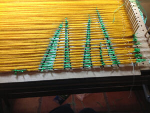
Category Archives: Design

It’s happened again

Rain-in-progress

Weaving in progress

The ikat weaving is going amazingly fast, (maybe because I’m enjoying the trashy novel I’m listening to) although it may not be exactly as planned. The motifs are not always aligning in the expected places, but I just adjust and keep on weaving. The problem is my logic and math skills, or lack thereof.

I weave at 24 ppi, which means that there are 12 wraps around the selvedge threads.

Selvedge

Selvedge

Twelve wraps around a peg on the ikat board makes a really big bundle, and it’s hard to wrap that bundle to get a good, clean edge on the design motif. So I decided to wrap in 1/2 inch increments. For some reason, I had it in my head that my cartoon would need to be stretched by 2 in order to get the motifs the correct size in the weaving. So wrong! For the first time, I have been measuring the motif in the weaving and writing the size on the cartoon, along with measuring the design motif on the cartoon also. The most that those measurements have is a discrepancy of 1/2 inch–the weaving being larger. Keep in mind that this is a cartoon stretched two times its original size. Does this mean that if I had used the desired finished size in the cartoon and still wrapped the yarn for ikat in 1/2 groups, the weaving would be exactly that size? My head is spinning, and I guess the only solution is to try it. In the meantime, I have enough wrapped sections to weave another piece. Do I really want to weave the same thing again?

Cartoon

Cartoon


From this to….this

Dyeing was to begin, and it did, but not without a snafu first. The yarn was in the dye pots, burners turned on, and I went back inside and set the timer. When I went out again, the burners were off and the propane tank empty. I attached a new tank (which I know was full because it was so heavy) and nothing happened. A bit of flame, then nothing. So, off to the propane place to refill the first tank. By then it was too late in the day, so everything was started again the next morning.  I untied the first sections so that I can weave even it the other sections are not dyed yet.  My big fear now is that the sections are going to be in different dye baths. Even if everything is done carefully, each dye bath will vary somewhat in color.

Stretched yarn tied

Stretched yarn has been tied with the design. The cartoon is visible beneath the stretched yarn.

Ikat-tied yarn pile

Ikat-tied yarn pile

Dyed-ikat-ties

Dyed

Dyed-ikat-no-ties

Ties removed

Drying-ikat

Hanging to dry. From here, the sections are wound into balls and then put on a rug shuttle. The labels will remain until the section is ready to be woven.


Learning lessons

Ikat So, 10 boards just like this one have been stretched between the boards and the pattern has been tied.

Label, label, label!

Label, label, label!

Ikat-tied yarn pile

Ikat-tied yarn pile. The picture of the pile of yarn doesn’t show how high the pile is.

My method for a design that has been stretched to 128 inches is to cut it into sections. I label each one with the title of the piece, top and bottom, and the number of the section. As I worked on this particular design, I decided that I needed to also label the width of each design element and the centers. You can see all the labels if you click on the picture.

After stretching and tying the yarn, I also label the top and bottom (ask me how I learned to do that!). So I thought at least.

When I dye, I weigh each skein and then use a formula for how much dye and additives to use. That’s harder for me to do with ikat, since there are sections that are tied off and there is no need for dye there. I had first thought I would use a 4% solution to get an intense color, but I’ve decided to go with 3% to compensate for the tied off parts. So, I separated that pile into the individual sections and weighed each one.

Forgot to add the labels before taking off the board.

Forgot to add the labels before taking off the board.

That’s when I discovered that one section had no labels for the top and bottom of that section. I put all of the the cartoon pieces on the floor, along with its matching yarn section until I found the correct one.

The yarns are all weighed, the spreadsheet is ready … Dyeing begins soon!

More squares

Squares, ©Sherri Coffey

Squares, ©Sherri Coffey

Here’s what I cut off from that horrible warp that I wrote about here. The warp doesn’t seem to affect the finished product, though.

I like the design except for one thing– the first group of diagonal squares on the right is the wrong color. That particular blue is too close in value to the background and becomes hidden. I’ve written about value before here. It’s often a problem of mine.

What could the title for this piece be? Hiding in Plain Sight? For now it’s just Squares.

Not much

Ikat in progress

Ikat in progress

Really not much going on around here. The ikat piece that I’m working on is going to be part of the idea for a prairie series. I had the cartoon enlarged to 120 inches, but after winding and tying the first section, I measured the actual vertical space available (Duh!) and cut the rest of the enlargement into 13-inch sections. Keeping my fingers crossed that my math is correct! As you can see, the ikat part is pretty simple–vertical lines, spread out. My process for this is pretty simple also. I have two huge cones of the wool that I use, so I wind a ball with doubled strands on my wonderful new ball winder, then measure on the ikat board, then tie. It takes about 300 grams for each section. Knowing that will make the dyeing more precise later on. Now if I could just get all my water faucets to behave themselves!

Public art

Tree-detail Last week I went to a presentation about public art hosted by Fort Worth Public Art. Usually I put these kinds of things on my calendar, and then talk myself out of going when the day arrives. In my effort to get to more art activities, I made myself go–yes, MADE myself–and I am so glad I did. The presentation was by a representative of Franz Mayer, a German company that constructs architectural glass and mosaics. A slide show of the many artist-designed projects was inspiring, and the process of creating those large art Tree-mosaic pieces was interesting. Getting the right colors by combining tiny bits of glass in a mosaic, laminating different kinds of glass for a particular design, painting on glass, airbrush, stained glass, mouth blown glass, you name it, it’s all done. There were brochures with examples of the work.  Above is a pic of one of the brochures. I was captivated by this tree, but then I opened the brochure and saw this whole scene from a subway tunnel. All I can say is, “Wow!” Artist Norie Sato was at the presentation and talked a bit about her designs for columns on a new parkway in town. Her work is beautiful and worth a visit to her website.

Matisse-and-textiles Another of my new favorite things to do is to use the interlibrary. I recently found out (through the interlibrary) that our local museums all have art libraries that are quite extensive and are available for anyone. This comes in handy when you’re thinking about buying an exhibition catalog or other expensive book. I have wanted to see the catalog Matisse, His Art and His Textiles for a long time, and there it was, just waiting for me to check it out! Artsits-and-textiles

There was also Artists Textiles 1940-1976, so I requested it also. It’s an interested book, with fabrics designed by artists. Some are really ugly, but that’s because they just don’t appeal in this decade. There are just some fashion decades that should be obliterated!

Both of these books have interesting bits, and perhaps even inspiring bits, but I am not going to buy them.


Habits, photography, beaters

ZigZag

My photograph

Habits, photography, beaters–now there’s a combination!

In reference to my post about habits, there is good news. My morning walk has become enjoyable! Instead of keeping my eyes forward to the distance goal for the day, my mind has started wandering, often to design and weaving. Yippee! Years ago, I walked five miles daily. One of the best things about that was going out for my walk with some sort of problem in my head and returning home with the solution.

ZigZag

Professional

This is a picture (left) taken with a good camera, but you can see how dark the picture is at the top, but especially the bottom, which means I need to learn about lighting.  As I think about this, the top part is because I was blending yarns from different dye lots. There’s a really bad picture–taken with my phone–on the Habit post. It’s not the phone’s fault that the picture is so bad; it’s that I played around with editing it, and the original disappeared. Monday I got a professional photo made (right). Find differences? What do you think? Better? Not worth it? Chime in.

Beaters


My new beater from Weaving Southwest arrived, and not a minute too soon. I am experimenting with weaving two small pieces at the same time, and this beater works better for this than the loom’s beater.  I love the weight, the length, everything about this beater. The old one is very beat up after being dropped on the floor too many times. I even glued a tine back on, but not successfully.

Do you see things graphically all around you? I do. Things like shadows, lines in a building under construction. Sometimes I detour to take pictures. Yesterday I saw a huge concrete wall being propped up with tall metal rods

Tornadoes Possible    West Texas Snowfall

Tornadoes Possible West Texas Snowfall

which crisscrossed each other. I loved the pattern, but unfortunately, while driving 65 on a busy highway, stopping for pictures is not possible. These small pieces are based on something I (we) see quite frequently on TV, in the newspaper, in social media, etc. I have no idea if they will be successful or not, but I’m experimenting with the rest of the warp on the loom, before I put a new warp of linen on. What everyday stuff appeals to you graphically? Keep a list and let us know.

Evolution of a design, part 3

Grass-ikat-design change

Prairie Fire

Grass-ikat-1

Prairie fire

©Sherri Coffey-Prairie Grass

Prairie Fire woven

For the last couple of posts, I’ve been dissecting a design process that happens sometimes. The piece was originally intended to have three sections, each dyed a gradation of the previous one. When I decided a design change had to happen, it was back to the drawing board, or in this case, the computer. At least I could get a bit of an idea about proportions, etc that way. The purple stripes in the drawing? Those were added as I wove. Some things just have to be decided on the fly, so to speak. The sections just needed a bit of separation, but the actual purple is only a few picks.

A name change was definitely in order. Meet Prairie Fire.

Evolution of a design, part 2

1.5-hours The design I wanted to have is shown in the previous post here.  Executing the design is a different matter entirely. Grass-ikat The plan was to do this in ikat, which presents its own set of problems, at least in the learning stage I’m in. (About this supposedly being yellow grass–that decision came about because of the ikat portion of this equation. The yarns need to be a color that can be overdyed nicely)  After enlarging the cartoon, I started tying the weft yarns, which is not a problem, just time-consuming. The yarns are then dyed Shuttle again, ties removed and it’s ready to start weaving. And that’s where the problems begin.

In order to weave the design that’s tied into the yarn, the warp needs to be the right width. Unweaving and reweaving happened over and over before the “real weaving” could begin. And I wasn’t really happy with the real weaving result, so a design change was in order. Two sections of this design was ready, and I was not going to spend more time tying more ikat yarns if I wasn’t happy with the weaving. So, another design was born.

Do you have a weaving project that just didn’t work after you stated weaving? Did you change the design, leave it as is, or what? Sometimes I envy quilters who have design walls where they pin up their design. I do the next best thing I can think of, but maybe there’s a better way. Next time…


Evolution of a design

Grass-ikat-drawing

Prairie Fire drawing

Grass-ikat-1

Prairie Fire

Prairie…what do you think about when you hear that word? Most people think of vast, flat land that goes on forever. That prairie is probably a tall grass prairie on the Great Plains. You can read a little about the Tall Grass Prairie here, and there’s a really interesting article about preserving the Tall Grass Prairie by setting fires here.  I recommend that one. Where I live here in Texas is the mid-grass prairie, although the Texas Parks and Wildlife Department calls it the Cross Timbers region.

Frankly, I never considered the prairie at all, and if I did consider it, probably thought it boring. That was before I actually studied it and came to appreciate it. Our prairie is not that vastly flat Great Plains. We have hills. Low hills, but hills. And this brings me to my real topic today.

A few months ago, I went to a lecture at the Kimbell Art Museum during the Picasso to Matisse exhibit. The lecture was really quite interesting, but as I was sitting there, I started thinking about possible weavings about the prairie. Before I left the lecture, I had thumbnails of many of my ideas and a list of more possibilities. Since that time, I have been trying to decide how to actually execute my ideas. My first attempt was not a total success, maybe not even a fractional success. The two drawings above show what I wanted to do in terms of depicting grasses. Yes, I know, it’s yellow. The rest of the story next time…