 On a cold, rainy day last week, I went to a members’ tour of the new Piano Pavilion at the Kimbell Art Museum. I usually talk myself out of these ventures when the actual time arrives, but not this time. The tour was wonderful and so interesting! And the building is beautiful! This visit was good for the soul.
As I was seeing all of the attributes of the building, I was thinking about how much planning and foresight has to go into a design. It’s not just a beautiful building, but it has many innovations. The ceiling inside much of the lobby is glass. Well, when I see glass, I immediately think of all our hail storms. This glass is of a very heavy-duty type, and it also has levers on top that can close if needed. The levers are normally in position to bring in as much northern light as possible. This is also a green building, with columns to harvest the rainwater. In the front galleries, the floor is wood, just as in the Kahn building, but they are placed so there is a bit of space between each board, which allows heat to radiate up from below. Other “green” features are thermal wells and using half the electricity of the Kahn building.
I’ve never paid much attention to the walls in a museum before, but after listening to an interview with Renzo Piano, and another interview with an art critic, the concrete walls were one of my must-sees. The color is a soft, blue/gray, and they are as smooth as silk, which is in fact, what they call this type of concrete. The art critic was talking about how the art pops against these walls, mentioning specially a terracotta bust. Mr. Piano told about how he had seen this concrete in Venice, found out how to make it, and brought it not only the “recipe,” but also the workers from Venice to Texas to make this wondrous stuff.

View from the Asian section to the Will Rogers Memorial.

One of the statues in the Asian wing. Love the shadows behind the statue!
Another feature is the Asian section–It’s all underground! Many of the scrolls can’t handle the bright lights so it’s all kind of dim, with strategic lighting. The atmosphere is mysterious and inviting.

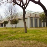
The hill above the Asian wing, looking toward the Will Rogers Memorial.
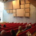 There is also a new auditorium. An acoustics expert advised to have a balcony, so there is one. These panels are on both sides to also aid in acoustics.
No picture of this, but there are also great studios to have classes, with running water and everything.
Here are some links to pictures that are better than mine:
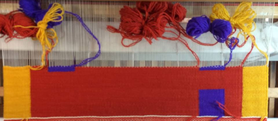
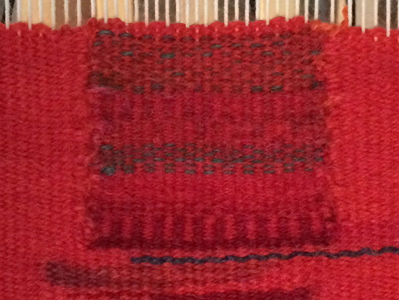
In the real world here in ikat land
Here’s my latest configuration for the ikat board. So far, so good.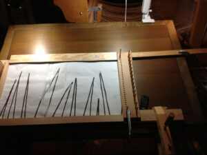 This is part B of the section done previously. I didn’t think this would work because of how the right top board sticks out from the edge of the table, but since it’s holding so far, this could also be the answer for the varying widths of designs.
Last thoughts
I’m still thinking about all the planning and the thinking ahead that an architect has to do in order to build a new building. Yes, we all have to think through a project, and often we learn the hard way that we didn’t think enough, but our projects are not nearly so grand. I am having to remind myself, yet again, to document, document, document. That will help having to learn all over again.
What’s your planning process like? Or do you go forth by the seat of your pants?

 like the hanging boards, postcards, etc.